
Final Image Preview
To begin with let’s have a look at the image we’ll be creating.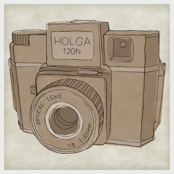
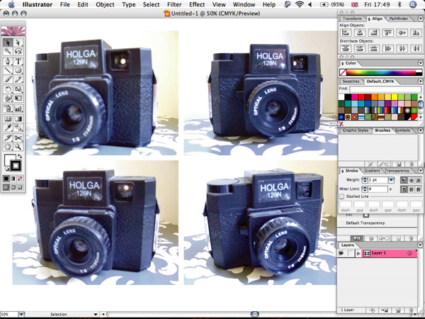
Step 1
Take a series of photos of your subject to decide which angle will work best. Here is the link to the camera image chosen.
Step 2
Import your chosen photo into Illustrator using File > Place. Lock this layer and create a new one on top of it.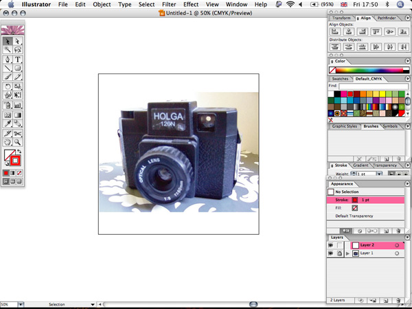
Step 3
Choose a red 0.5 pt stroke, with no fill, and use the Pen tool to start tracing the outlines of your image. Start with the main outlines then the inner lines. You don’t have to be too accurate, as we’re going to be distorting the lines later.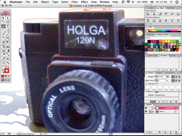
Step 4
Use the Pencil tool to draw the finer details.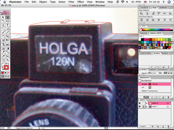
Step 5
Now that we’re done tracing we’re going to make the drawing feel more hand-rendered. Choose the Wrinkle tool (it’s in the Warp tool sub-menu).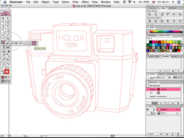
Step 6
You might have to experiment with the settings to get the desired effect; here’s what I used.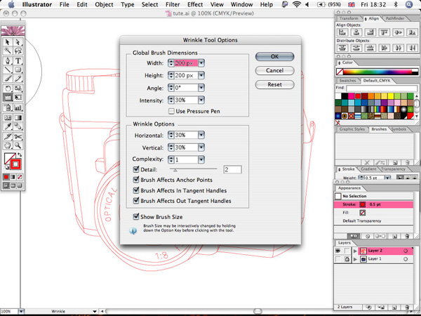
Step 7
Lock your finer details by selecting them and hitting Command+2. Click quickly all over your image to wrinkle the lines.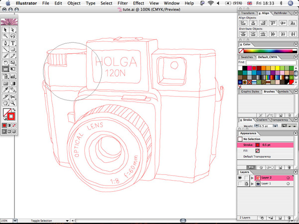
Step 8
Now tidy up a bit using the Direct Selection tool to join up all the stroke ends again.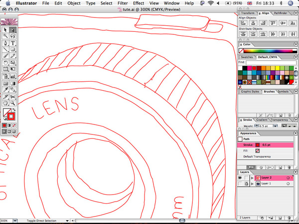
Step 9
You might also want to use Object > Path > Simplify to tidy up, especially if the wrinkle effect was too pronounced in an area.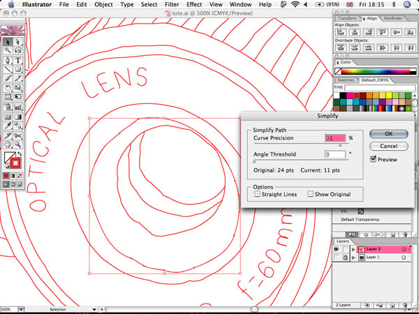
Step 10
Now unlock all your lines, select them all, and make them black. Then vary the stroke widths a bit. Make the main outlines wider (around 1.5 pt) and the finer details thinner (0.5 pt – 0.7 pt).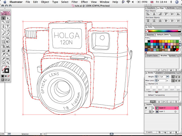
Step 11
Now we’re going to make a custom art brush to apply to our lines. Draw a thin oval, as shown below.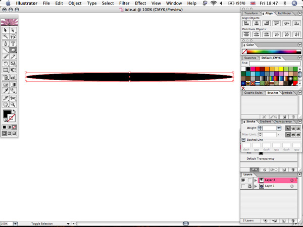
Step 12
Use the Wrinkle tool again on it.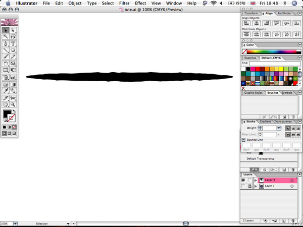
Step 13
Then scale it down vertically to make a thin line that looks like a scratchy ink line.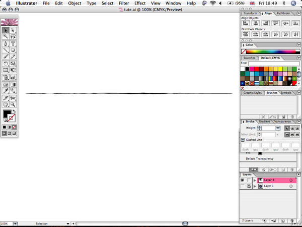
Step 14
Drag your line into the Brush panel and select Art Brush from the prompt.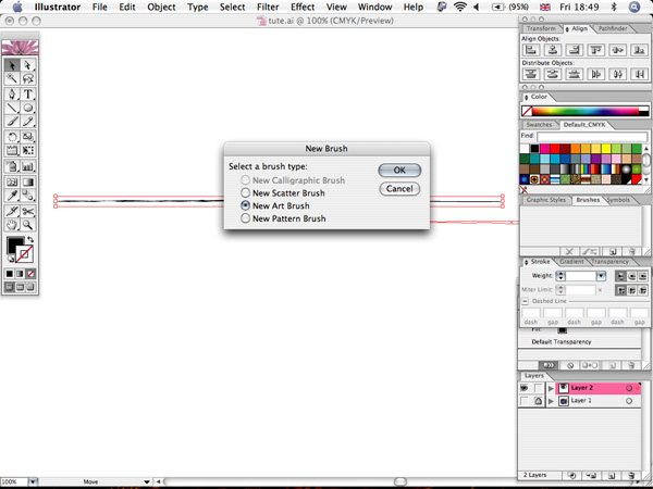
Step 15
Apply your custom brush to the strokes. You might have to alter the stroke widths again to get it looking right.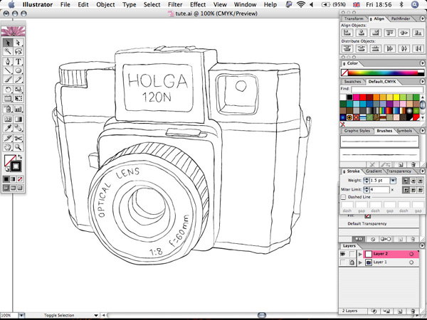
Step 16
Now we’re done in Illustrator, and it’s time to add some color in Photoshop. (You could do all these steps within Illustrator too, but I find it easier in Photoshop.)Paste your lines into Photoshop. Create a new white background layer below it. Then create another new layer in which you’ll add your first color.
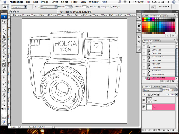
Step 17
Use the Polygonal Lasso tool to roughly trace the main outline. Then fill it with a mid-toned color (it’s good not to use realistic colors, but tones of the same shade). Create a new layer above this one for each shade of color. Fill shadow areas with a darker tone and highlight areas with a lighter tone. Aim for about five separate colors.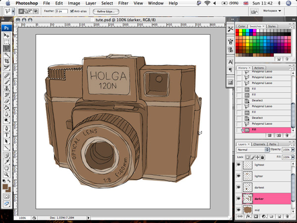
Step 18
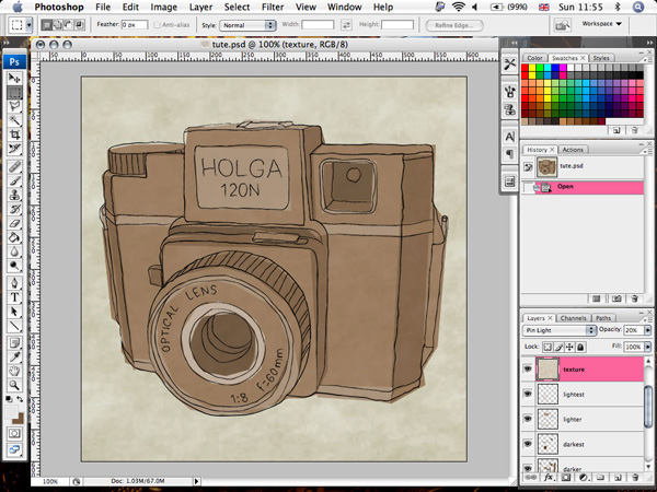
Finally, add some texture. Get a scan or stock image of some textured paper. I scanned in some paper for this design. You might have to up the brightness and contrast and set the color balance a bit more red/yellow for warmth. Paste the texture right above your background layer. Duplicate this layer and place it below the lines layer and above the colors. Set the Blending Mode to Pin Light and the Opacity to 20%.
Conclusion
One final tidy up of removing any bits that are too spiky and altering opacities on your color block layers slightly. I added a frame to suit the image’s subject – and it’s done!
Tidak ada komentar:
Posting Komentar